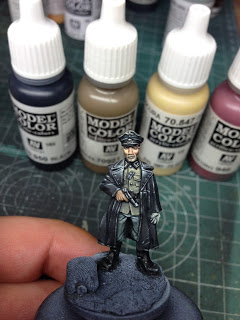
Started with a German Grey base color. Well diluted… should take a couple of layers to cover.
The way I am applying the color is to drag the diluted paint across the area where I am painting and to push that small drop of paint into a fold or a corner or something where the shadow color would be really strong.
Then used some German Grey with a little bit of Green Grey and roughly applied it to areas where the coat would catch some light.
At this point it is really more sketching than fine, controlled painting… I intensified the shadow areas with a mix of German Grey and Black (also diluted Black Ink) and I started sketching out the lights mix a pretty light color with a lot more Green Grey in it.
Back view
Over the next few pictures you can see how I go back and forth between the following steps:
* build out highlights and scratches going all the way to pure Green Grey and sometimes to Bonewhite
* soften the highlight transitions with various mid-tones of light grey and mid-grey
* intensifying shadows with dark greys and black
* correcting mistakes over and over again and sometimes also correcting the position and size of highlight or shadow areas
Back view
Slowly, slowly making progress
Back view
I also vary the dilution of the paint during this process. I will use strongly diluted color to soften out transitions. I will use somewhat diluted color to paint sharper highlights or shadows. And I will use almost undiluted color to paint really small, sharp lines and dots for final highlights and shadows.
Back view
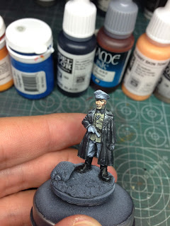
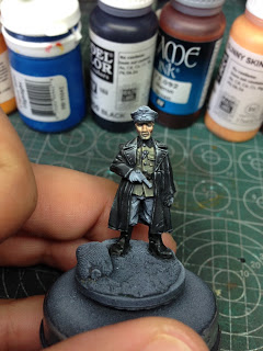
To make the coat a bit more interesting, I applied strongly diluted brown ink to the upper half and strongly diluted blue ink to the lower half.
If anyone can explain to me why this picture came out more blue in general than the others, I would appreciate a hint. Same iPhone, same light, same time of day, etc…. Weird.
Back view
The uniform jacket got painted using German Fieldgrey as a base. Mixed in Sunny Skin Tone for highlights and Black for shadows.
Painted the buttons and the ribbon on his chest first with Black. Then used white for painting the sides of the ribbon and for placing highlights on the buttons.
As I had Sunny Skin Tone on my palette anyway, I mixed it with Brown Ink and a bit of water. Used this diluted mix to put on multiple layers as the base color for the face. Make sure to let each layer dry completely before you put on the next.
Added in Black to the mix and painted the eye sockets.
Increased the lights on the upper half of the face using Sunny Skin Tone.
New day, fresh palette for continuing with the face. On here we have Sunny Skintone, Iraqui Sand, Brown Ink, Blue, Yellow, Red and Black.
Explaining the exact process is kind of difficult, because I don’t follow a series of exact, fixed steps. I alternate between painting lights, shadows or mid-tones and using highly diluted, reds, yellows, greens, etc. to glaze in additional color tones.
At this picture here, I have not yet glazed in any crazy colors. Only used Sunny Skin Tone, Brown Ink and Iraqui Sand.
Still working on overall lights and shadows…
Starting to mix in reds around the cheeks:
Glazing in green-grey tones in the lower third of the face.
Intensifying some of the red and greenish glazes…
Rebuilding some of the lights and painting in some stronger shadows, then glazing again.
Status update from my palette.
Cleaned up & corrected some of the lights and shadows. Happy with the facial expression now. 🙂
I have to admit that it is very hard for me to get all the lights and shadows exactly right the first time. I am not a natural talent when it comes to that. So what I have to do instead is to do trial and error quite a bit. I paint a light or a shadow somewhere and chances are that I don’t get it right… so I keep working and correcting to get it looking the way I want. Sometimes it goes really fast and sometimes I will paint over an area over and over again many times until it looks more or less like I want. It can be painful. 😉
More minor corrections…
Different angle
Painted the trousers with Bronze Green as the base color. Added in ###Grey and Bonewhite for the highlight color and Black for the shadows.
Time to paint the Officer’s Hat. For this, I used the same colors as for the trousers (Bronze Green, ###Grey, Black and Bonewhite) but applied them in different ratios as I wanted to get a darker color overall for it. The lines at the rim and the emblems got a base with Black and then straight Bonewhite on top of it.
Different angle:
Painted the collar with Black and Bonewhite:
Using English Uniform, Dark Red and Dark Sand, I painted the left hand. For the pistol I used Black and White (and a tiiiny bit of blue in the last highlights). For the gloves, I mixed a light-grey color on my palette from what was already on the palette:
Update from the palette:
Moving on to the base…. Again, just using what I have on the palette, I slab on different colors and blend them wet-in-wet. For the sack, I used primarily English Uniform, Black and Dark Sand… also painting mostly wet-in-wet at this point:
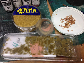
Next, I started adding greenery to the base. First a a few of the small grass tufts from MiniNatur. This this I added some of the grass&flock from Galeforce nine. I also glued on some small “leaves” which are essentially birch seeds that I collected sometime ago. When all of the glue was dry, I added some heavily thinned washes of grey green and sprinkled on the pigment (pastel chalk powder) that you see in the middle of the picture below.
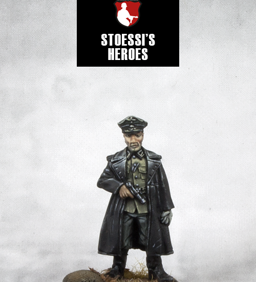
Fertig!
Want to get your own copy of Hans? Hop over to Stoessi’s Heroes Store or check out one of our resellers.








Many thanks for this tutorial, especially how you paint the faces!
Splendid tutorial. Thank you.
Excellent tutorial, thank you 🙂
Most welcome tut! Many thanks for that and my hat off for the attention to detail. You're definitely going to great length with each of your figures and the results are certainly worth it.
Very interesting style of painting especially on the black coat. By the way, the reason why your photo turns out bluish is because of the lighting in your room. It’s the auto white balance in your phone/camera that tries to help you get a neutral tones. In some cases it gets fooled and you either get a too warm color tone or too cool (in your case, blue).
Thanks Mark! When doing final pictures with my DLR camera, I apply a custom white balance based on pictures with a greycard. But when I am doing shots straight at the workbench, I just use my iPhone which doesn’t give me the same amount of control. Any suggestion how I could improve my quick WIP shots with the phone?